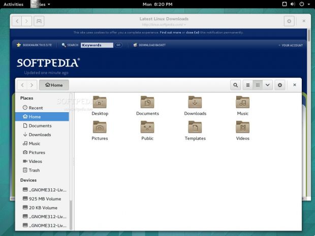
Apple has just announced OS X Yosemite, the new and improved Mac OS, but it turns out that at least one of the design decisions from the new operating system is not "original."
Apple is usually boasting with things that other companies and operating systems have been doing for a long time, so it was to be expected that some aspects of OS X Yosemite would be presented as new and innovative when, in fact, they're not.
Users have noticed on Reddit that the title bars from OS X Yosemite look an awful lot like the ones from GNOME 3.12. This open source desktop environment was released only a short while ago, but that particular feature has been in the works for a long time.
Cramming all the buttons and other options into the header bar is not exactly a new idea, and even the guys from elementary OS already have it working on their system, for the new Isis.
To be fair, Apple presented a lot of new stuff last night and most of the new features are pretty interesting, but when they say something is original, users should check that twice before believing it.
In the Linux community is not about who did it first. This is about giving proper credit to the people who made it happen in the first place. There is a slim chance of that happening with Apple and GNOME.

 14 DAY TRIAL //


